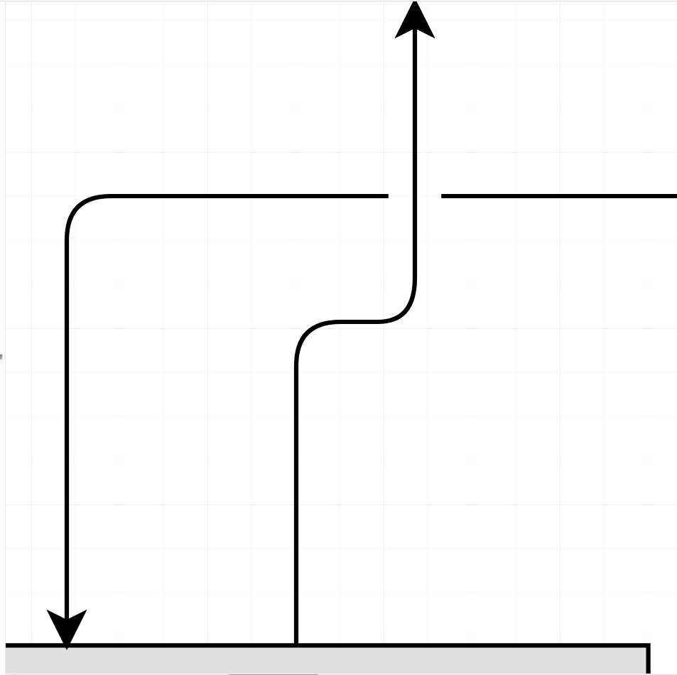
Currently, the lines which connote entity-relationships in dbdiagram are all the same color and become hard to follow as many lines cross oneanother  . In dense areas, lines have to be traced individually to learn where they go making it easy to lose track of which connections go where after birefly looking away to another document, or another part of the diagram.
In some cases, multiple crossings can be resolved by rearranging the tables in order to uncross the lines  . However, attempting this can get cumbersome for diagrams featuring large numbers of tables and is sometimes literally impossible
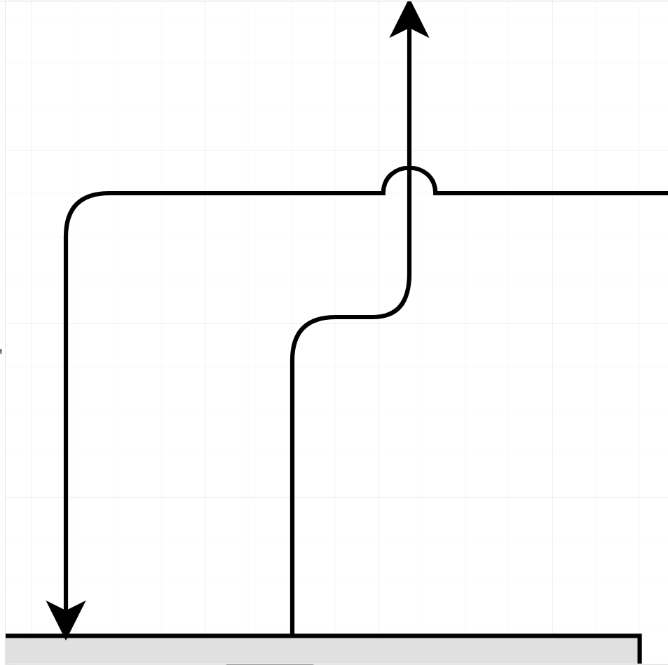
A number of diagramming softwares  have recognized this problem and do something special when lines intersect make it more clear that a crossing line hasn’t made a 90° turn along the path to wherever it’s headed, like so:

This is especially helpful for database diagrams, since the arrows traditionally have 90°-angle turns anyways, which can make it hard to distinguish whether a given relationship-arrow should be read as going straight, or making a turn. Though beveled turns help a little bit, they may still become hard to see  in large diagrams which require negative zoom-levels to view in full.
In the same way,  colored lines would help to mitigate this as well, but this does nothing for those who are colorblind
  . As such, I would consider a universal toggle for handling intersection-behavior as a big step forward for this tool.
