Possible improvements to interface/visualization

I love the ease of creation of the models simple by typing the DBML code.

Suggestions for improvements

  1. Colored interconnecting lines for the relationships so that it’s easier to differentiate on the display, and arrows indicating flow direction.
  2. Ability to collapse/expand non-linking data fields on the display to make layout easier to comprehend.
  3. Resize model to full size of viewport (especially horizontal space).
1 Like

Thanks for sharing your suggestions David! Well noted on the above suggestions.

We’re already working on (2) and will announce when it’s released (note that that feature will likely be in Pro plan).

For (1), it’s well noted and in our backlog.

For (3), could you elaborate more on what you mean by that, and a potential use case?

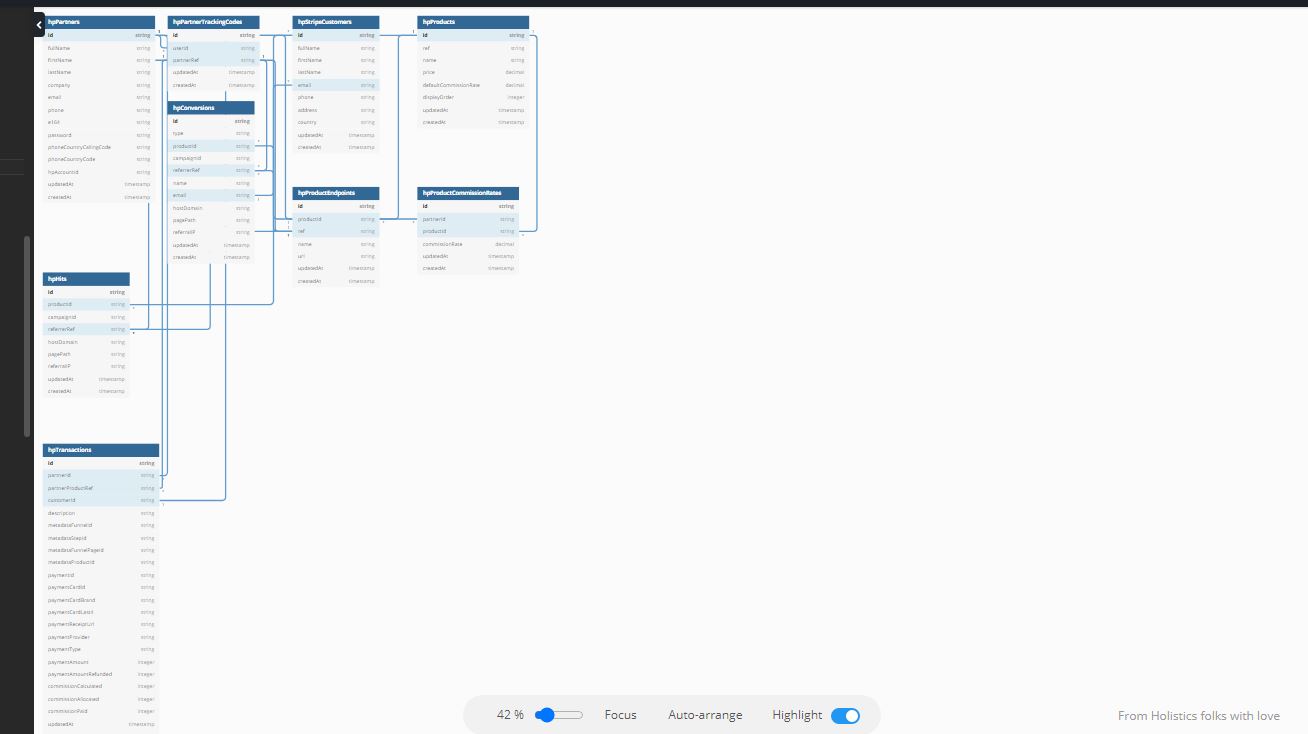
Regarding 3, what I mean is that when you do Auto-arrange, it really creates all the tables concentrated at the left side of the screen, and I find that a LOT of white space is empty on the right side of the screen.

An algorithm that fitted the tables into the full-width of available space would make it much easy to view the overall structure.

I also noticed in the sample structure, that there were
////Level1
////Level2
////Level3

but I couldn’t discover any info about how they might be used and what impact they might have on the layout of the visualization.

Maybe they might help me in optimizing my layouts

Here’s an example of what I mean.

I just did auto-arrange and this was the result

Here’s the same structure after I manually arranged it

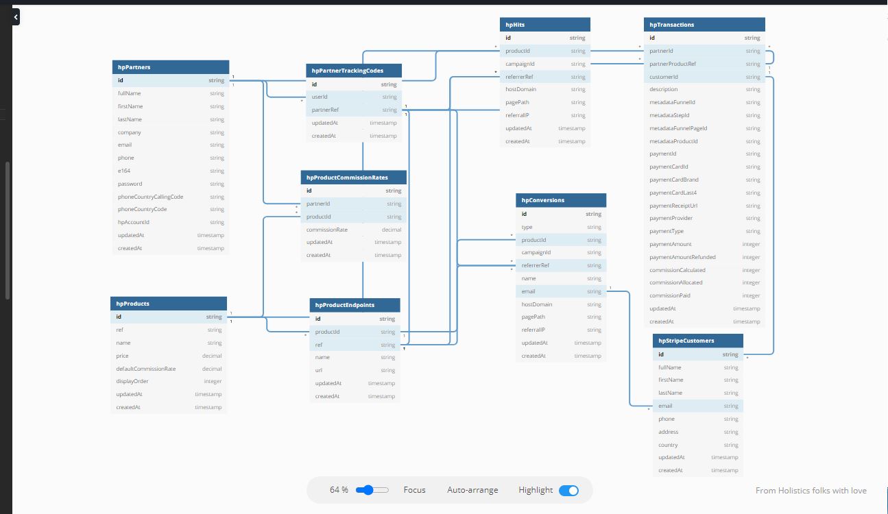
As you can see from a comparison of the images, it’s much easier to use the structure once it has be sized to fit the available screen space and use the full width

AND, it’s actaully easier to see the true relationships compared to the auto-arranged layout.